Projects

Here are all of the projects I have created/worked on since the summer of 2014 (when I first got into developing things). Tech-centered projects are listed before design-centered projects, and within these categories, projects are listed in roughly reverse-chronological order.


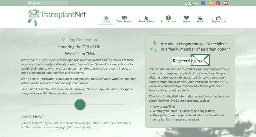
TRANSPLANTNET

Click on the screenshot to see the live website.

DESIGN/MARKETING MATERIALS

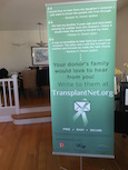
TNet Banner
TNet Banner - Real Life
Large banner (6' x 2.5' + stand base height) placed in outpatient clinic waiting room
TNet Sticker
Sticker placed on each transplant patient's medication card at participating transplant centers
TNet 500 likes graphic
Image posted on Facebook page to celebrate 500 likes
TNet 500 likes graphic
Image posted on Facebook page to solicit donor family testimonials

MISSION

Increase correspondence between deceased donor organ transplant recipients and the families of their donors.
          Ensure that 100% of donor families receive a letter from their loved one's recipients.
Inspire visitors to become registered organ donors, saving lives.

MEANS

Provide a free online platform that processes easy correspondence between organ transplant recipients and their donor families.
Post letters from users at their discretion to demonstrate the deep impact of organ donation on both donor and recipient families.
Share information on living and deceased-donor organ donation and transplantation.

DEVELOPMENT

TransplantNet's conception emerged from my dad's complaints about how difficult it was for people saved by organs from deceased donors to contact the families of their donors. My dad is an organ transplant surgeon, and many of his patients ask how they can thank their donor families, whose identities are confidential. The traditional method to do so is a convoluted, long process that requires serial forwarding of postal mail. Also, many transplant patients did not—and still do not—receive clear instructions on writing to their donor families. These factors have made the rate of correspondence between transplant recipients and donor families regrettably low, especially considering what it can mean to donor families to hear from someone whose life was saved by their loved one. My grandmother was an organ donor, and we unfortunately never heard anything from her recipients.

And so our solution, TNet, was born. With funding from a community service grant from my high school, I built the web application myself from the ground up during the summer of 2014, and the free system was officially launched in October 2014. My dad and I met with social workers and transplant coordinators throughout development; I used their feedback to perfect TNet, making sure that it incorporated all the safety measures included in the regular mail correspondence process and complied with healthcare privacy law. Besides coding and design, the project also entailed branding, writing all of the content, getting legal documents, "pitching" social workers, and other jazzy things.

Besides having made a slew of colorful, static websites when I was in elementary school, I had no programming experience when I started working on TNet. I ended up learning PHP, MySQL (SQL), Javascript, the Bootstrap framework, and Wordpress development that summer. I know PHP gets a lot of flack but personally... I love it! It's great for beginners, was perfect for TNet, and hey, who doesn't love $?

Currently, TNet's online correspondence system has been adopted by UCSF, one of the largest transplant centers in the country, the Stanford Heart Transplant Program, and Donor Network West, the organization that serves donor families in Northern California. We're working to expand to other areas and be adopted nationally by the end of 2017, with a planned presentation at the 2016 Association of Organ Procurement Organizations annual meeting. Besides continually improving and administering the website, I also work on marketing initiatives targeted at transplant recipients, reaching out to transplant centers/donor networks, and managing communications with all users.

TECH

Informational component: HTML5, CSS3/Bootstrap framework, JS, Wordpress (PHP)
User portal component: PHP, MySQL (SQL), HTML5, CSS3/Bootstrap framework, JS/jQuery, Cron

Qt Jobs

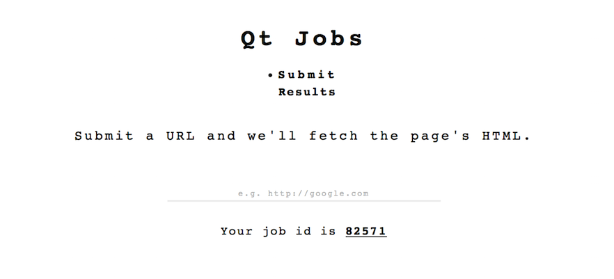
Click on the screenshot to see the live app.

TWO COMPONENTS

First, a RESTful API that fetches and stores the HTML from a URL – see Github repo for details.
Second, a working web app that consumes the API. GitHub

TECH

Consumption example: HTML5, CSS3, JS/jQuery, PHP
API: PHP, MySQL (SQL)


NETWERK
IN PROGRESS

WHAT IT IS

An app for network contact management. GitHub

HOW IT WILL WERK

Tech: React, jQuery, PHP, MySQL
Netwerk will have basic functionalities similar to an Excel spreadsheet. Users will be able to log, catgorize, sort, and search through their network contacts. They will also be able to set/receive networking-related reminders (e.g. about following up with a contact) and send contacts to other users.


STRAIGHT SHOT LLC WEBSITE

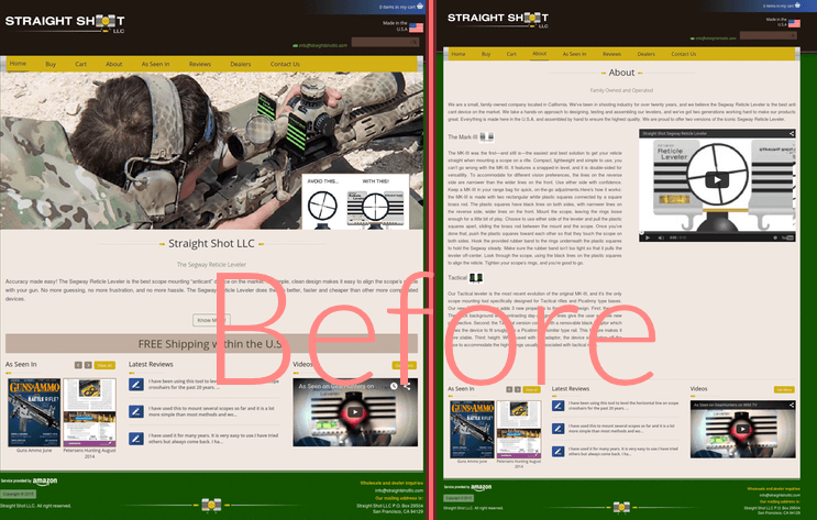
BEFORE

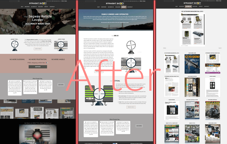
AFTER

Click on the screenshot to see the live website.

THE BACKGROUND

Straight Shot LLC is a family-owned business that sells a popular scope mounting device. Before, their eCommerce website (run on Wordpress) was in a pretty sad state of existence. The colors of the layout were all over the place—we're talking bright mustard, grass green, cobalt blue, and more—and the content was unadorned. There were also multiple functional issues: the website was unusable on mobile devices, the "Cart" button didn't work, the product descriptions were missing, the front page featured a "slider" with only one picture, the YouTube videos autoplayed competitors' videos when they ended... and the list goes on.

THE JOB

Using the text that was already there, I completely revamped Straight Shot LLC's entire website. The job included designing and implementing both a new responsive Wordpress theme layout and original content presentation design for each page. The website now features seamless embedded video, brand-enhancing colors and fonts, parallax effects, clear calls to action, and more to promote their product. I beautified the WooCommerce (shop) styling, fixed the quality of their (previously pixellated) product images, installed an analytics tracker, and improved their SEO. And finally, I fixed all of the site's previous functional problems.

THE RESULT

One very happy nicoback client!

TECH

PHP, HTML, CSS, JS, Wordpress + Woocomerce, Pixelmator for graphics and images


OUTSIDEIN
IMPROVING THE OUTSIDE LANDS EXPERIENCE TOGETHER

DESCRIPTION

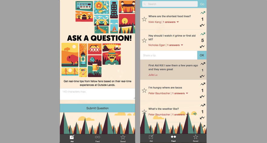
Where are the shortest bathroom lines? How is public transit leaving the festival right now? What's the best food find? Where are the after parties? What's the weather actually like out there?

At any given time during a music festival like San Francisco's Outside Lands, someone will have a real-time, ultra-specific question such as the ones above that can only be answered by a fellow festival goer. Thus, my hackathon teammates and I built OutsideIn, a mobile app through which fans can ask and answer Outside Lands-related questions live at the festival. By drawing on the collective knowledge of the festival crowd, OutsideIn becomes a hub of insider tips that can't be found anywhere else.

OutsideIn was created for the hackathon, Outside Hacks 2015.

FEATURES

  • Ask and answer public questions on the live feed
  • Upvote/downvote system
  • Stickied questions set by admins
  • Weather and food-related answer bots
    • Weather Underground API
  • Save questions and tips for later
  • Non-anonymous: uses Facebook login
  • iOS and Android Compatible

PRODUCT

Slides
Demo Video — Disclaimer: we had less than 10 minutes left before the deadline and less than 1 hour of sleep logged over the past 24 hours when we made this (required) video. Can you tell?

TECH

Ionic framework – AngularJS, HTML5, CSS3, Cordova APIs
Firebase, JSON

I primarily worked on the back-end.


Visual Python Physics Simulations

DESCRIPTION

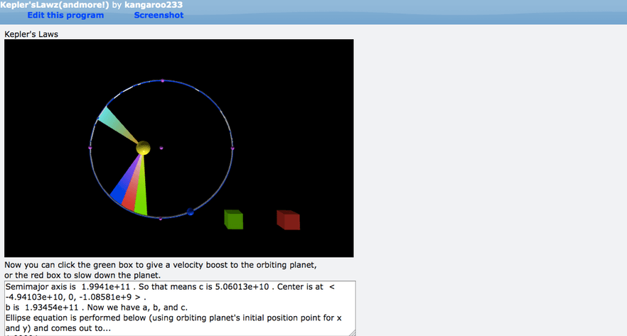
I made a few interactive simulations related to various physics concepts I learned over the course of the AP Physics-C: Mechanics and Electricity & Magnetism class I took during senior year of high school. Simulation topics include electrostatics, circuits, rotational dynamics, and Kepler's Laws (conservation laws).

TECH

Visual Python and RapydScript on the in-browser Glowscript IDE

LINKS TO SIMULATIONS

Kepler's Laws Proof & Orbiting Planet
Graphing Solutions to Oscillatory and Transient Circuits
Electrostatics 3-D Simulation – featuring "electric field hockey" and my teachers' and TA's faces as charges!
Cone Pendulum (Rotational Dynamics) – featuring my teacher's face plastered on a cone!


CLUSTER CARE

Click on the screenshot to see the live app.

WHAT IT IS

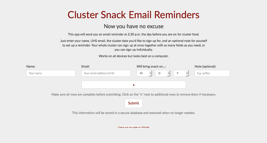
An app for setting up timed email reminders about bringing food. GitHub

WHAT IT DOES

Sends users an email reminder at 2:30 p.m. the day before they are signed up to bring food for their advisory groups, or clusters. Users can append as many fields as they need to the sign-up form. After submission, the app enters the input into a MySQL database, and the web server runs a script every day (set up via a cron job) to send the reminder emails needed.

BUT... WHY?

I made Cluster Care specifically for my old high school, where snack for weekly cluster meetings is a big deal. Students who failed to bring cluster snack on the day they had signed up to do so would be censured and ostracized by their peers.* Many faculty advisors (including mine) promised to send email reminders to their advisees, but they often forgot. As Kevin O'leary would say... Stop the madness!!! Why not just automate the reminders?

I came up with the idea in a grocery store during winter break 2014, and Cluster Care was ready to go when school was back in session. Building CC was good practice for me, and I learned how to use multidimensional arrays in an HTML form so that I could process the user-appended fields on the back-end easily.

So did it work? Well, yes and no. The app worked perfectly in terms of doing what it was supposed to do, but tragically, a few people who used it somehow still forgot to bring snack. Even though I've since graduated, students and faculty at my high school still use Cluster Care.

TECH

Front-end: HTML5, CSS3/Bootstrap framework, JS/jQuery
Back-end: PHP, MySQL (SQL), Cron

*exaggeration

ASES VC3 EVENT WEBSITE DESIGN

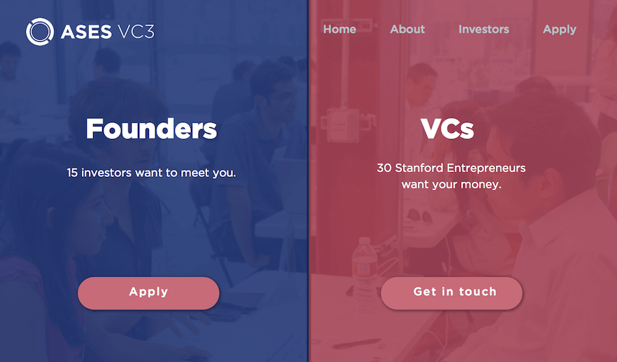
Click on the screenshot to see the full mockup.
Note: As user continues through the canvases, the blue and pink lines should extend down as the user scrolls.

MY JOB

I am a member of Stanford Asia-Pacific Student Entrepreneurship Society's (ASES) marketing and design team. My role entails designing wireframes and mockups in Sketch for ASES's event websites in alignment with content briefs and the organization's brand.


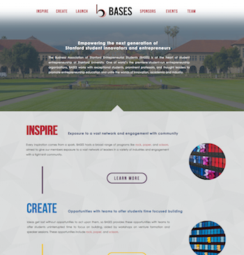
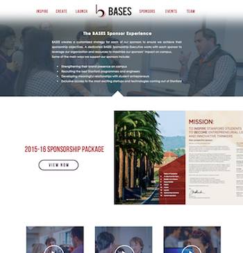
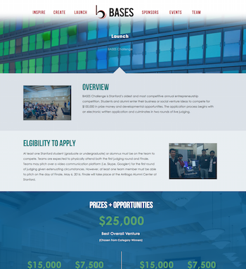
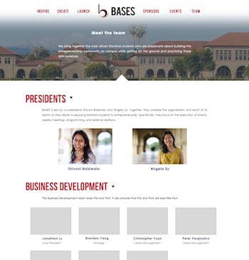
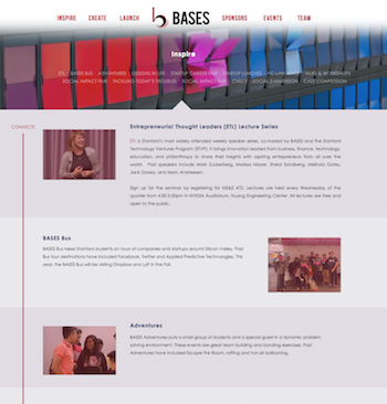
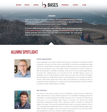
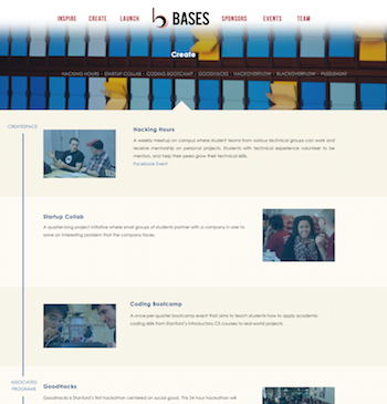
BASES WEBSITE REDESIGN

Click on the screenshots to see the full mockups.

WHAT IS BASES?

The Business Association of Stanford Entrepreneurial Students is one of the largest student entrepreneurship groups in the world and at the center of entrepreneurship at Stanford. With over 12 teams, 80 officers, 300 current general members, its mission is to empower the next generation of entrepreneurs. I am the Internal Communications Officer on the Operations team.

THE REDESIGN

The Operations and Business Development teams are redesigning the BASES website to fit new branding guidelines, improve its aesthetics and draw more sponsors to BASES. I made the wireframes and mockups based on sketches from the business development team.


MUNCH

HIGH FIDELITY PROTOTYPE

Note: The intention is that swiping right on a post = upvote and swiping left = downvote. Invision doesn't support swipe gestures properly, though, so in this prototype, clicking towards the top of an image is "swiping right" and clicking towards the bottom of an image is "swiping left"; clicking in the middle area is normally tapping on the image.

TWO THINGS

  1. Finding good food to eat (especially local favorites!) in the moment can be difficult and time consuming, particularly when you are with a group or in an unfamiliar area.
  2. People love taking and sharing pictures of their (good) food. Fun fact: all the photos in the prototype are from my friends' Instagrams!

THE PRODUCT

Five teammates and I designed Munch, an app for fast, localized, and FUN food discovery. Users anonymously upload photos of their dishes and provide information about them. These photos are then posted to the local feed. The Munch feed ultimately becomes a real-time look at the great food around you.

No more endless searching and clicking, outdated photos and restaurant listings, and decision paralysis!

INTENDED FEATURES

  • Upload pictures of great food from phone gallery or camera
  • Feed contains most recent photos of dishes uploaded within a 5-mile radius
    • "Teleport" to places you may be going to later to check out the food there (i.e. change the feed location)
  • Click on a photo in the feed to see its price range, the diner's comments, and where to get it (including directions to the restaurant)
  • Users' posts are stored and accessible in their history
  • Upvote and downvote system: swipe right on a dish photo to upvote, swipe left to downvote
    • Photos with too many downvotes are removed from the feed
    • Users can only see the score of their own photos
  • Notifications tell users when their photos are upvoted/downvoted, when there's a promotion happening, etc.

THE PROCESS

Our team developed Munch using design thinking. I conducted concept testing interviews, created rapid prototypes, ran user testing trials, designed and produced the final high-fidelity app prototype (above), and helped develop our business strategy.

TECH

Sketch, Invision; PHP and MySQL for one rapid, web-based prototype